Kollide Film Festival
It all begins with an idea. Maybe you want to launch a business. Maybe you want to turn a hobby into something more. Or maybe you have a creative project to share with the world. Whatever it is, the way you tell your story online can make all the difference.
Don’t worry about sounding professional. Sounds like you. There are over 1.5 billion websites out there, but your story is what’s going to separate this one from the rest.
Branding


Strategy
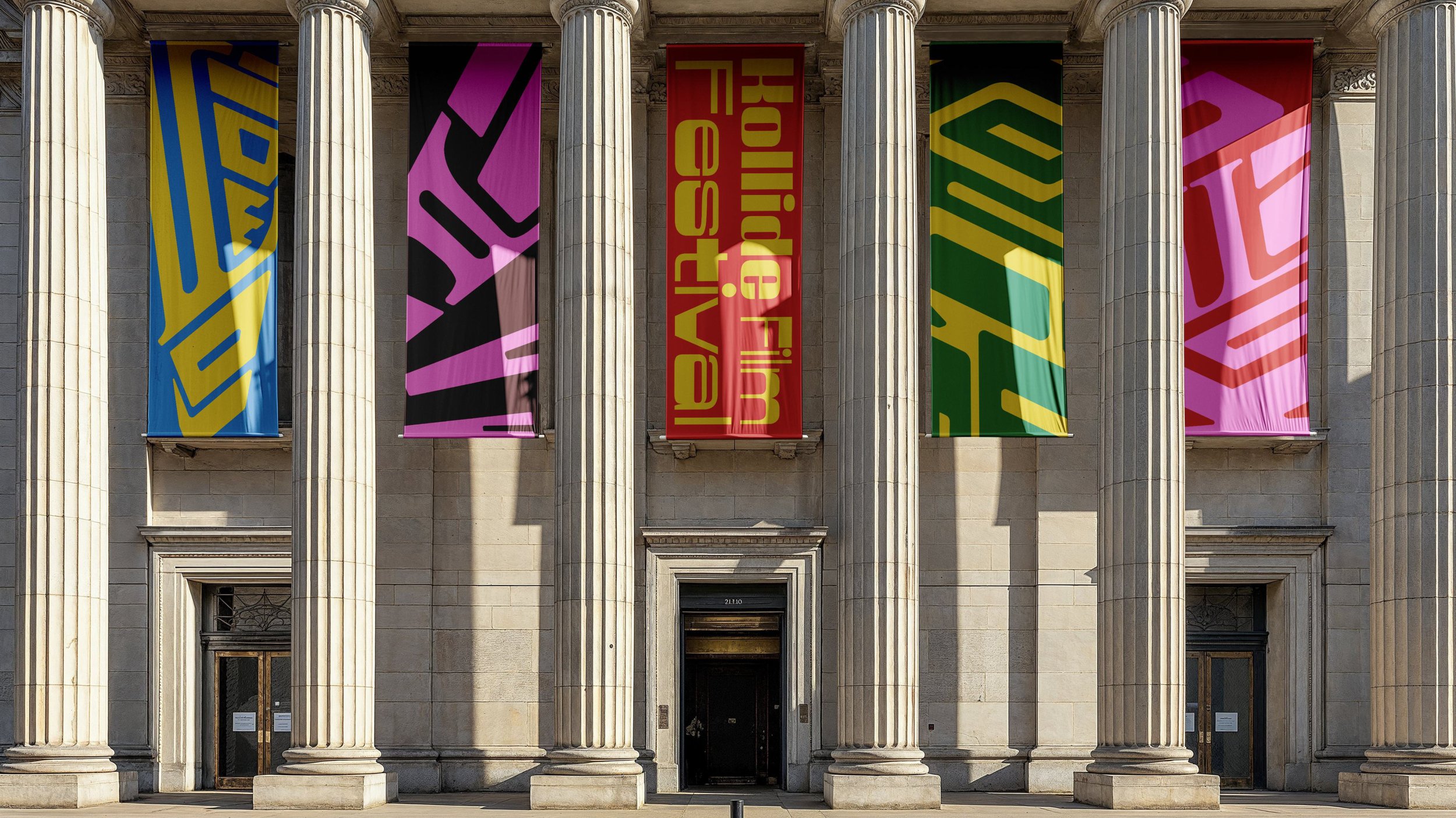
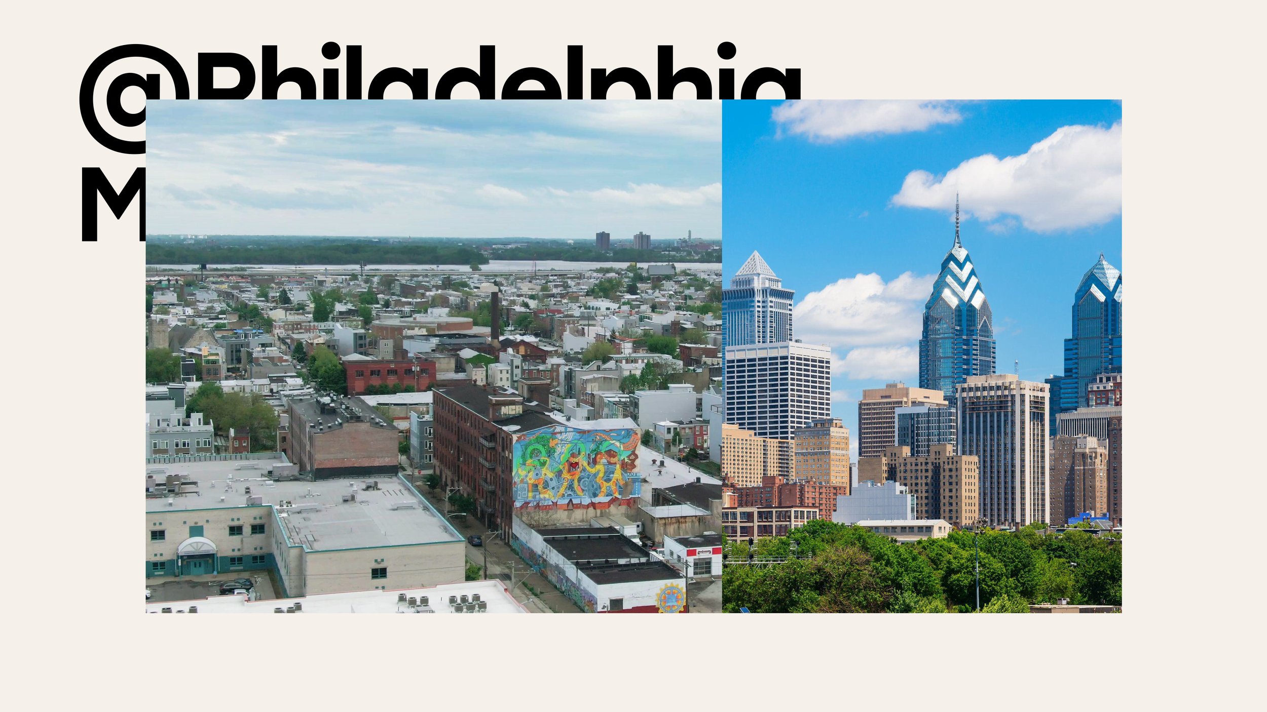
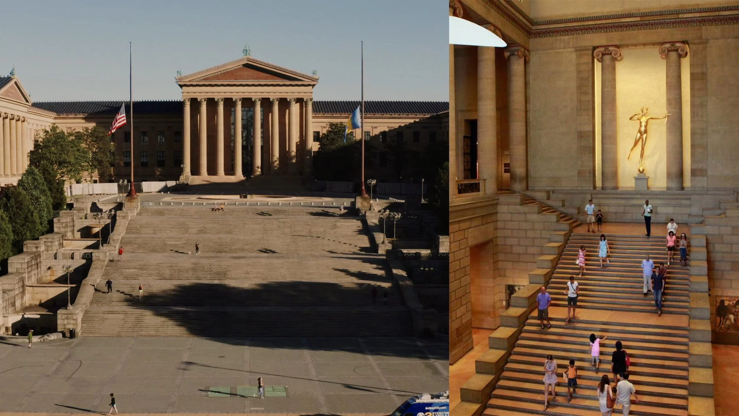
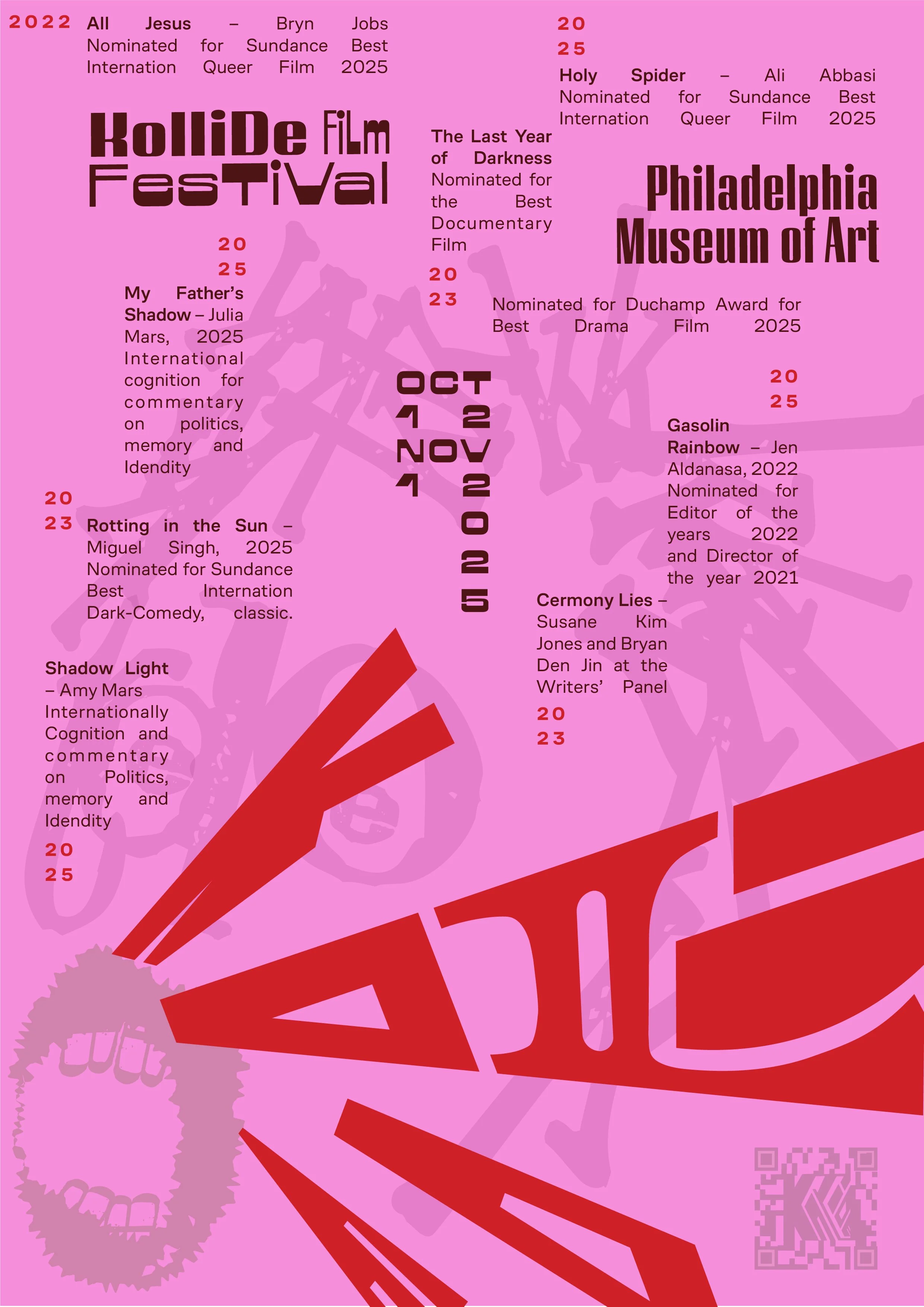
An anti-glamor film festival focused on archival storytelling, behind the scenes, rebellious scripts, political commentary, anti-capitalistic small production films and screenplays. Located @Pheladelphia Museum of Art in the heart of Philly and its rich history of murals–a rebellious form of art and public storytelling.
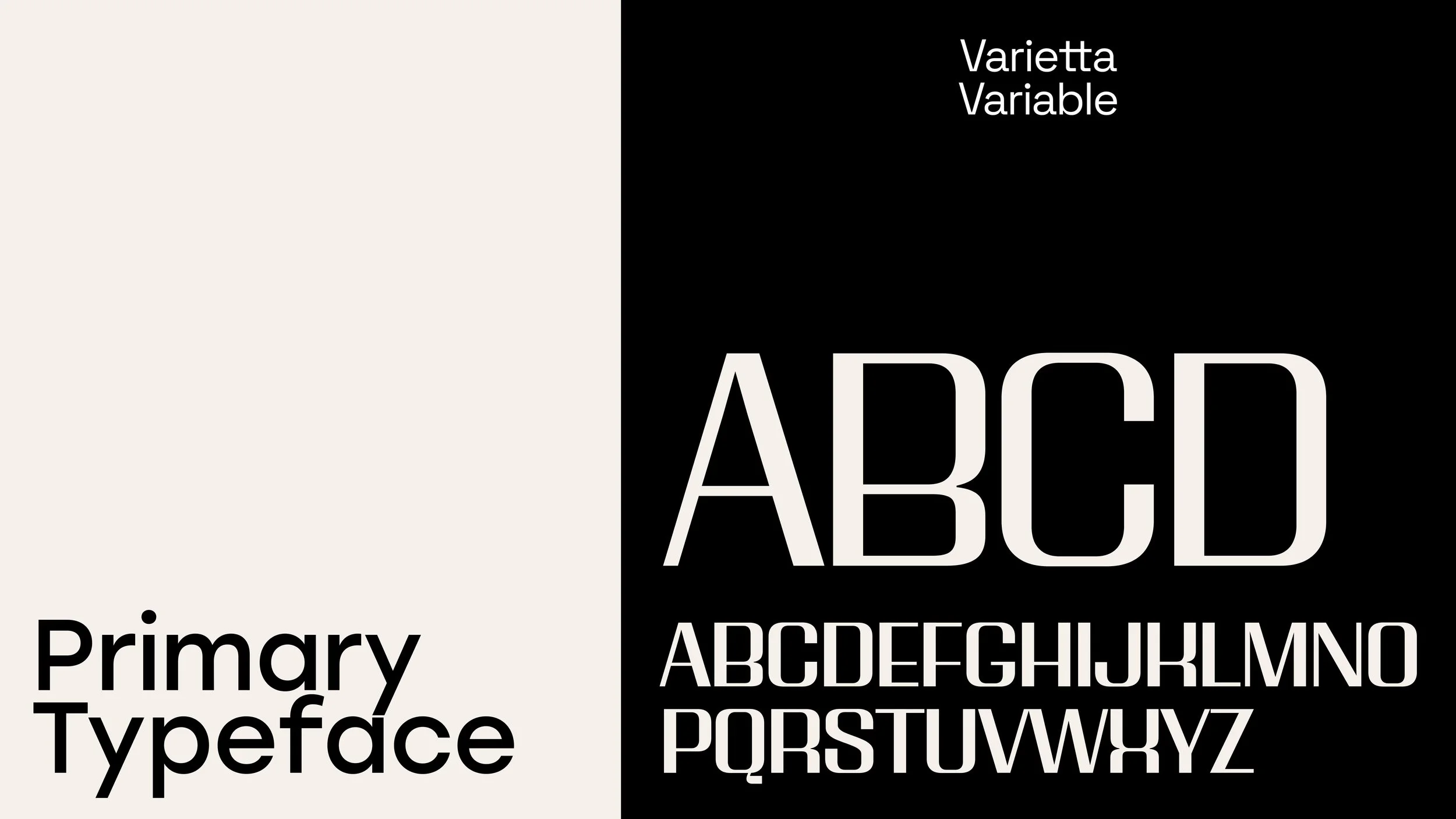
Typography
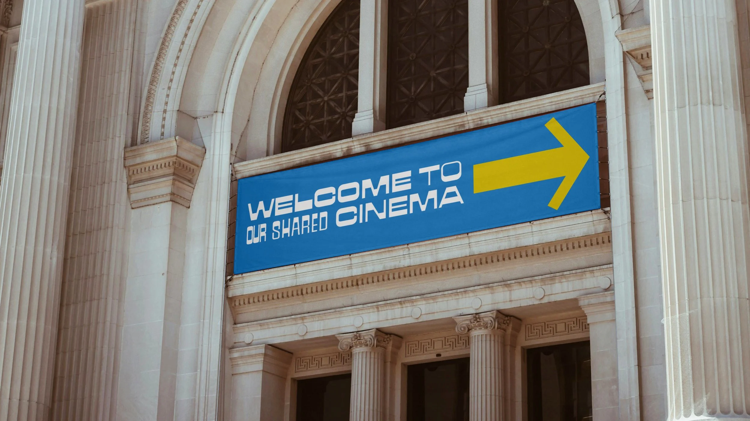
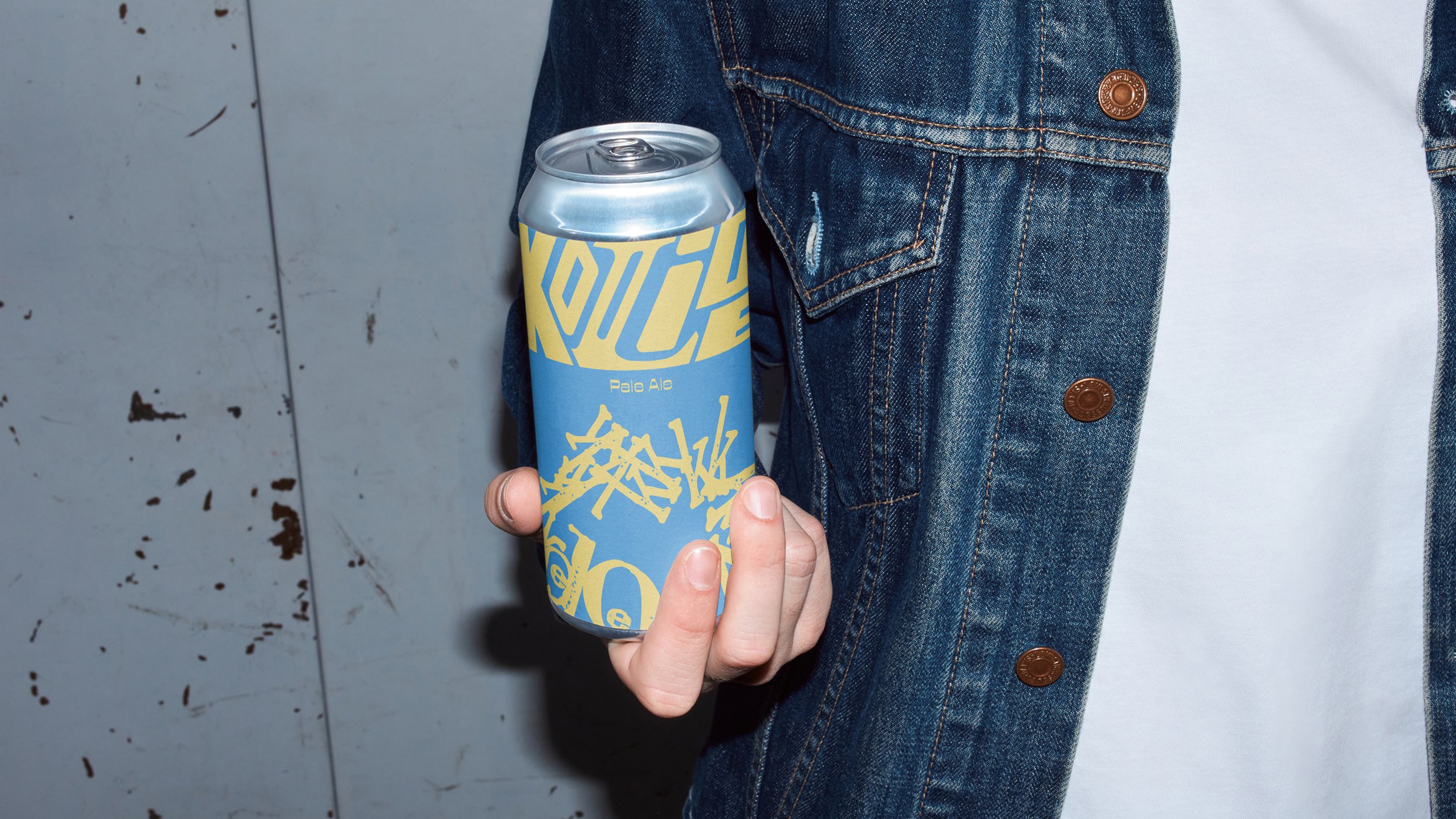
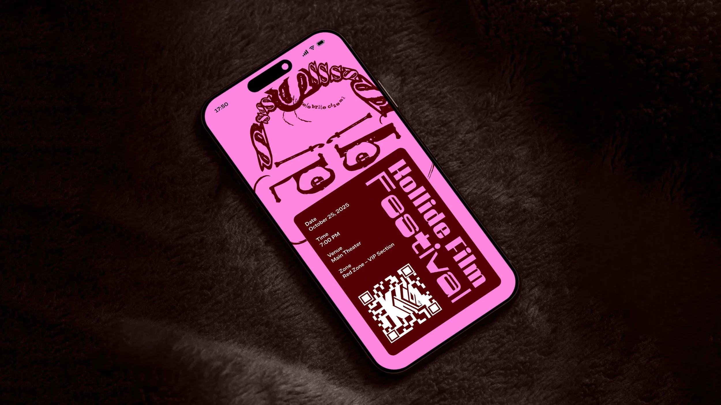
Variable typography to give a language of varied expression to the voices silenced elsewhere, and the stories too raw for the mainstream. We used Varietta Variable for its distinctly unapologetic and bold quality, unafraid to grow louder if needed.
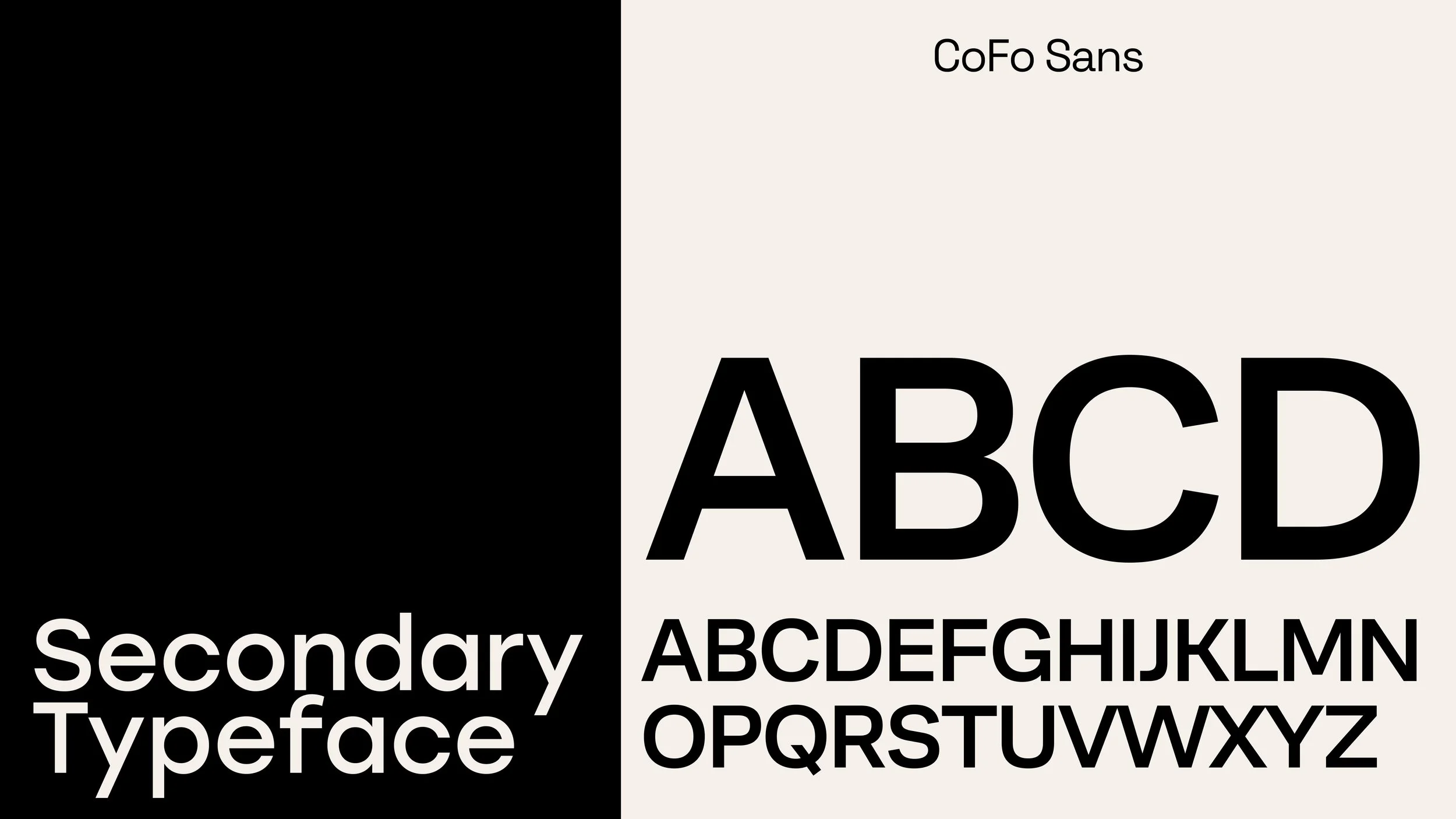
The secondary typeface, CoFo sans, brought balance and stability back to the visual language.
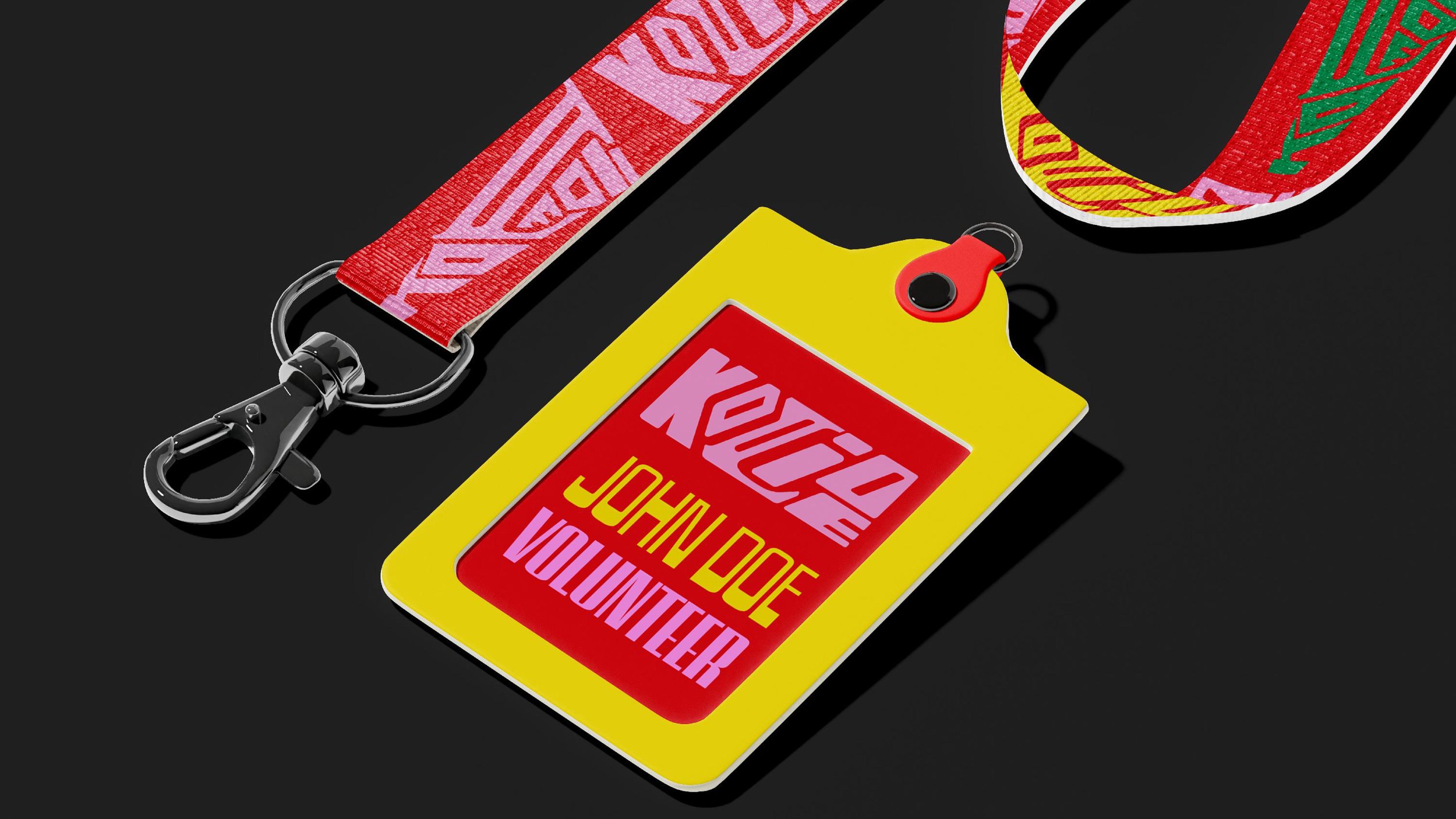
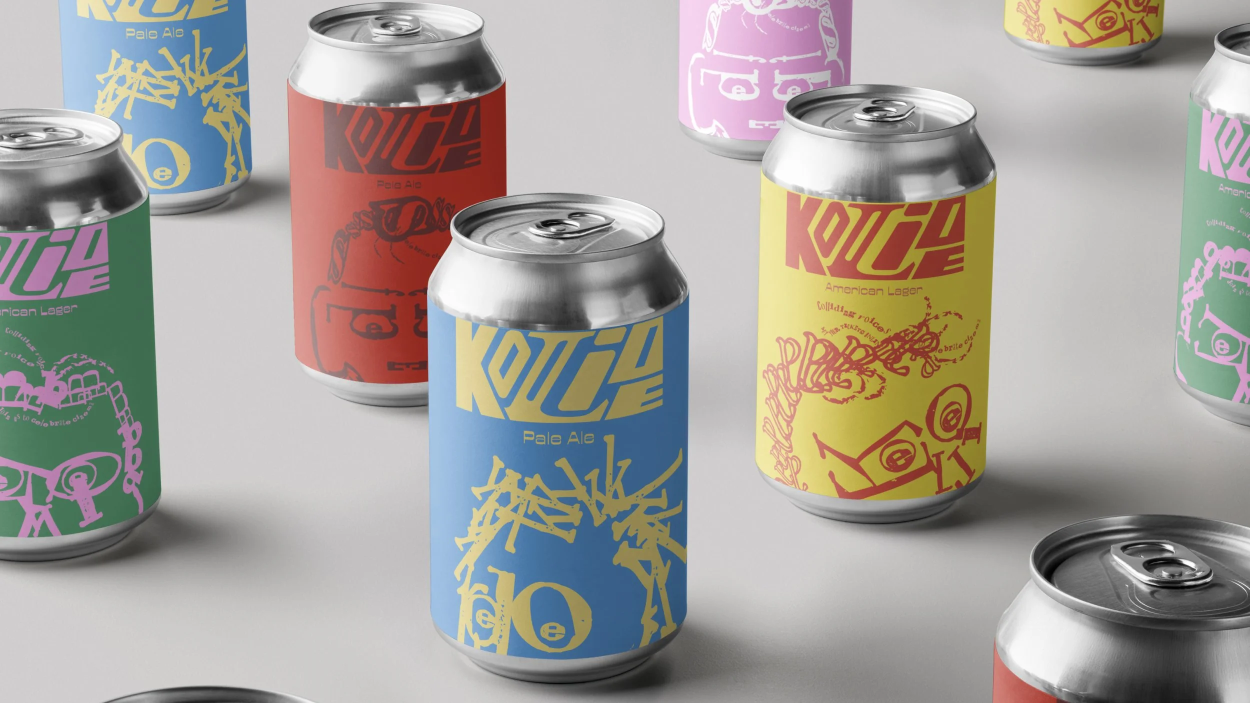
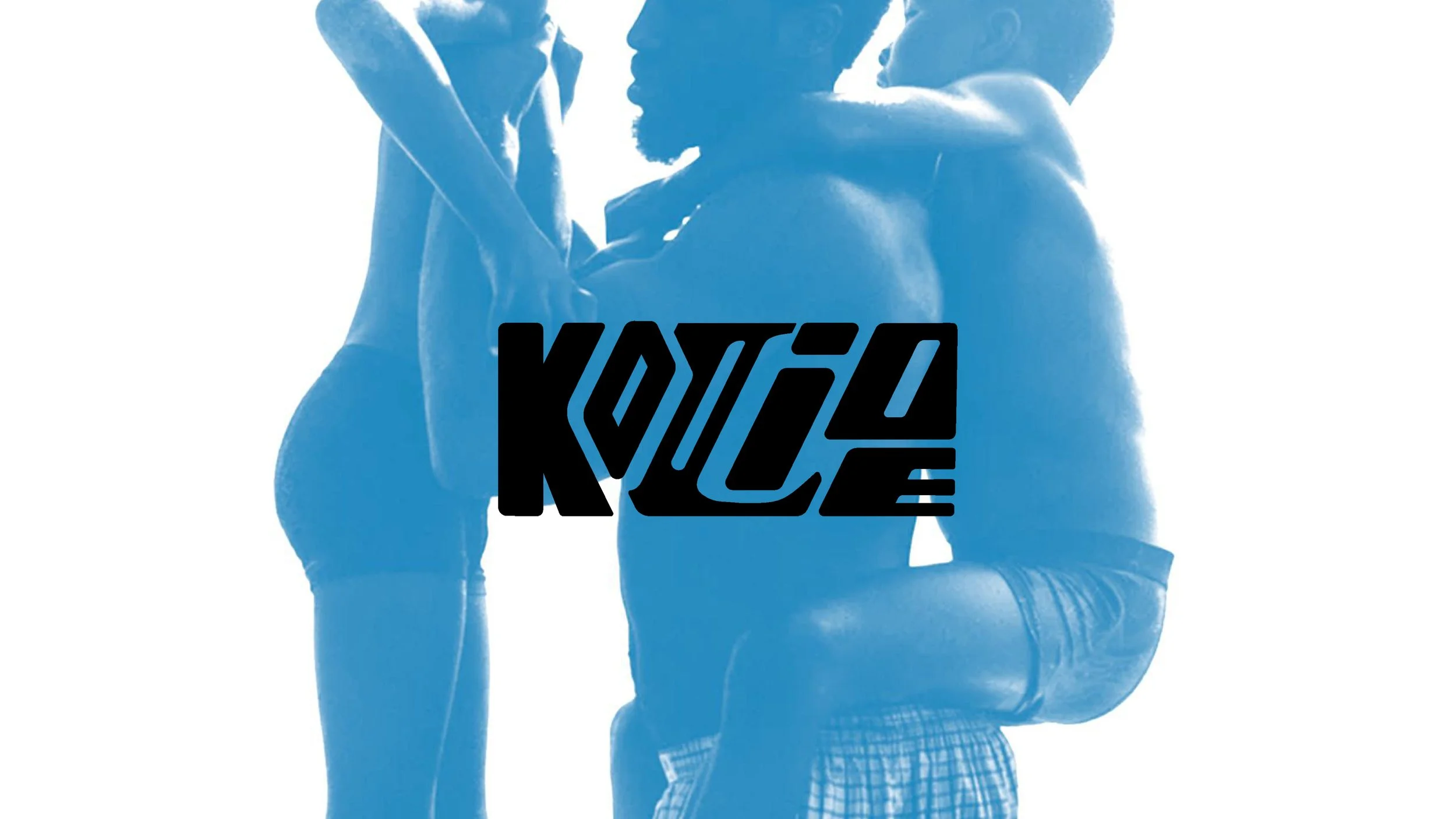
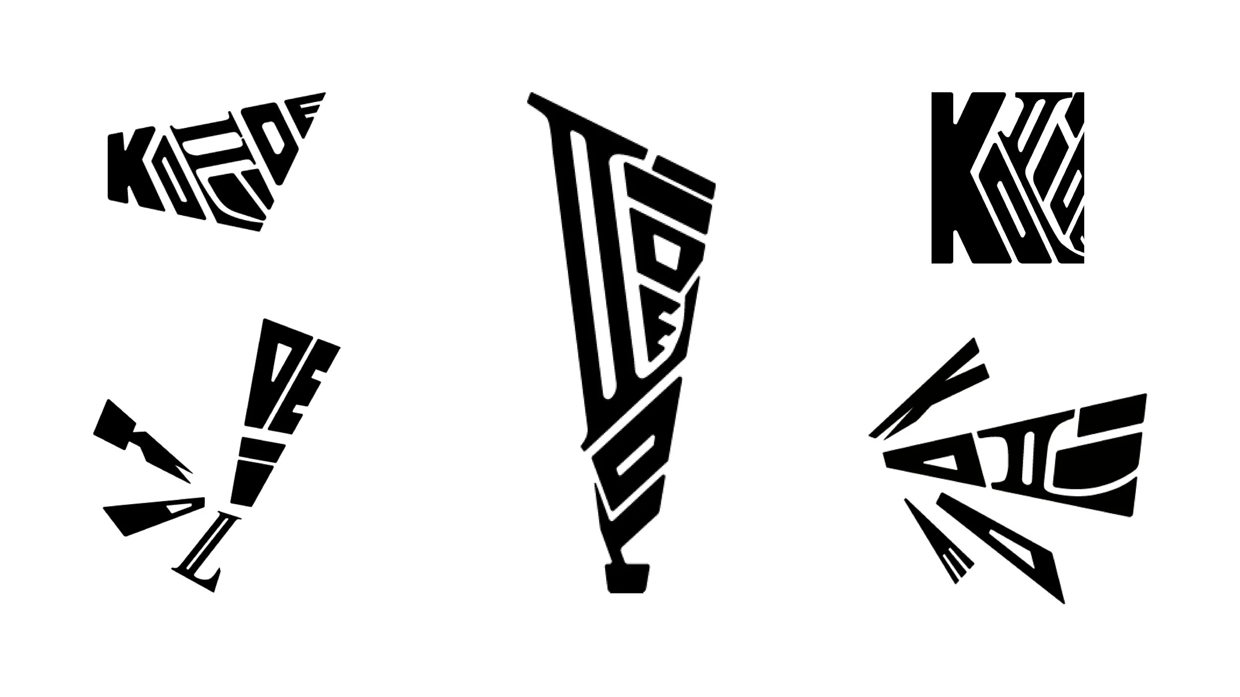
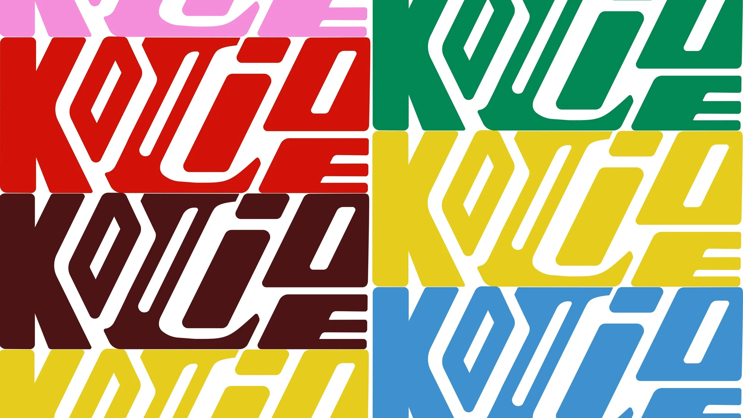
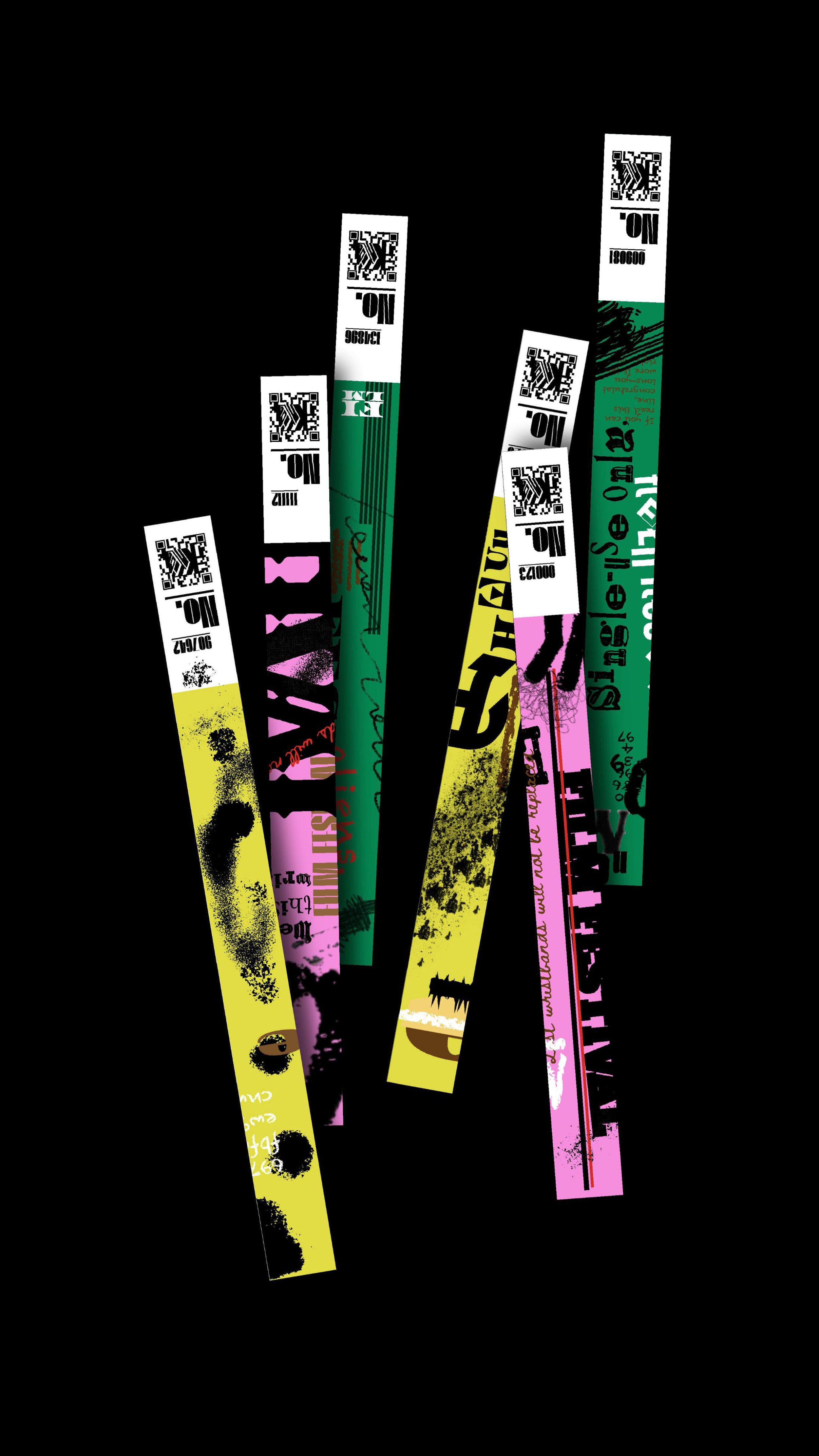
Logo System
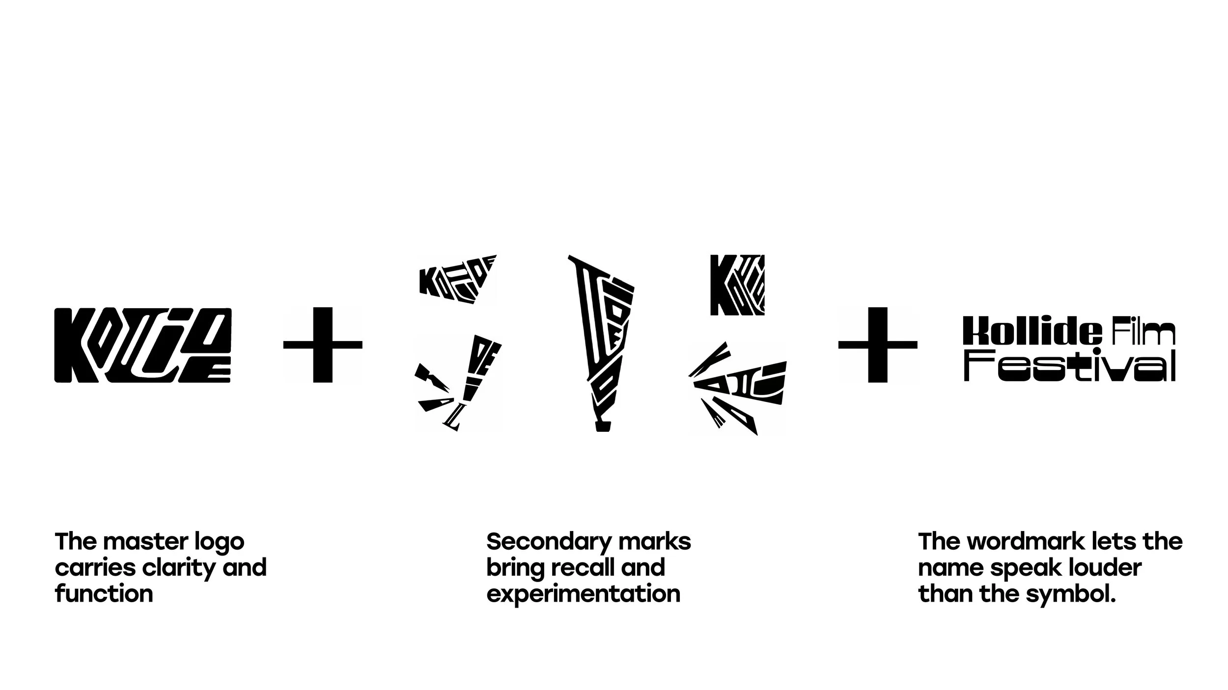
Our identity lives in colliding different elements. The master logo carries clarity and function.
Secondary marks bring recall and experimentation.
The wordmark lets the name speak louder than the symbol.
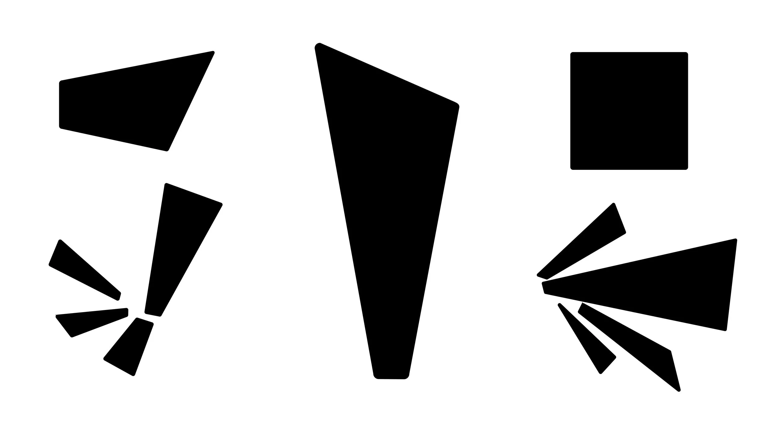
SKETCHES
Color System
xxx
UPDATE THIS
UPDATE THIS
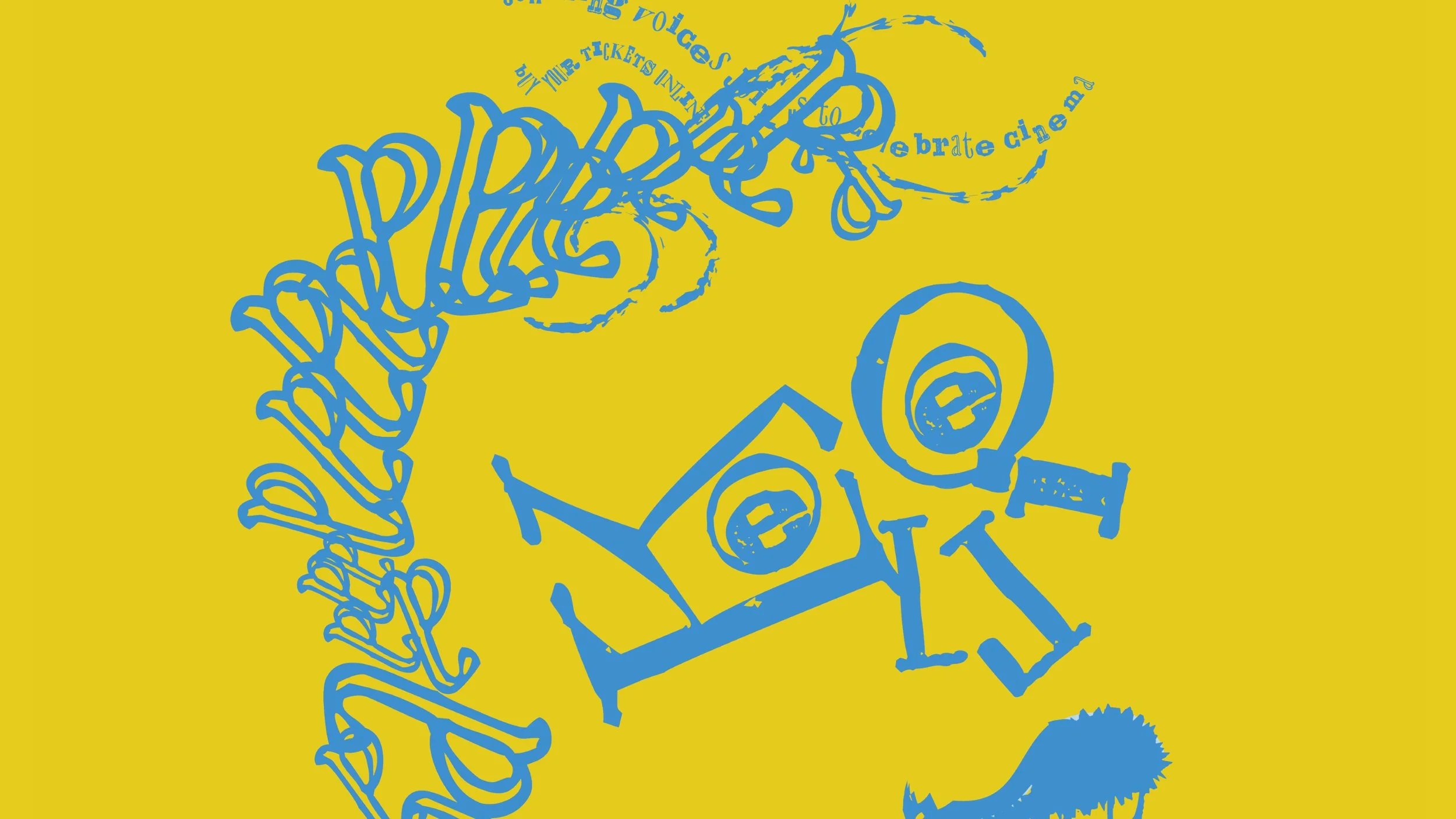
Illustration
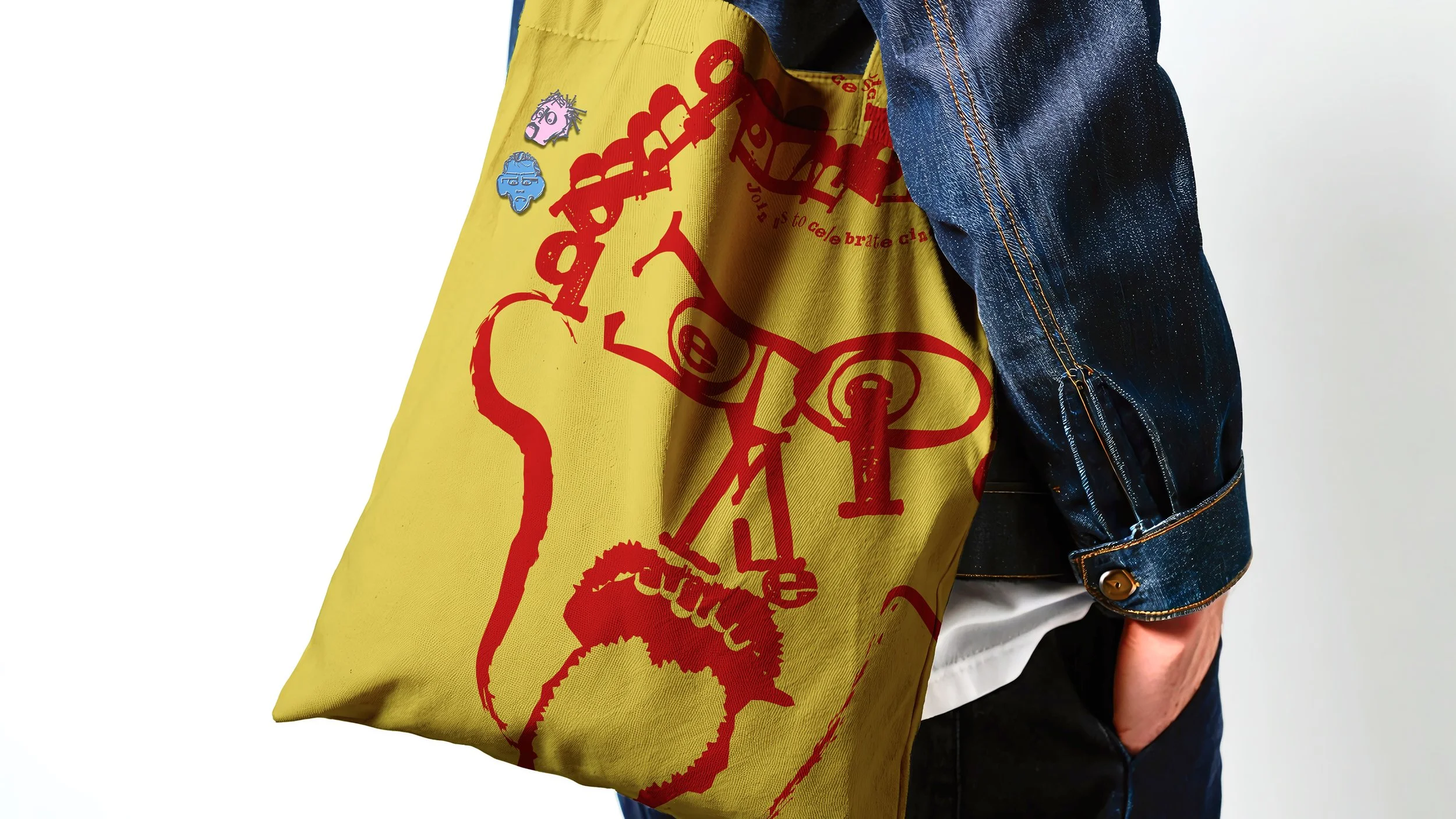
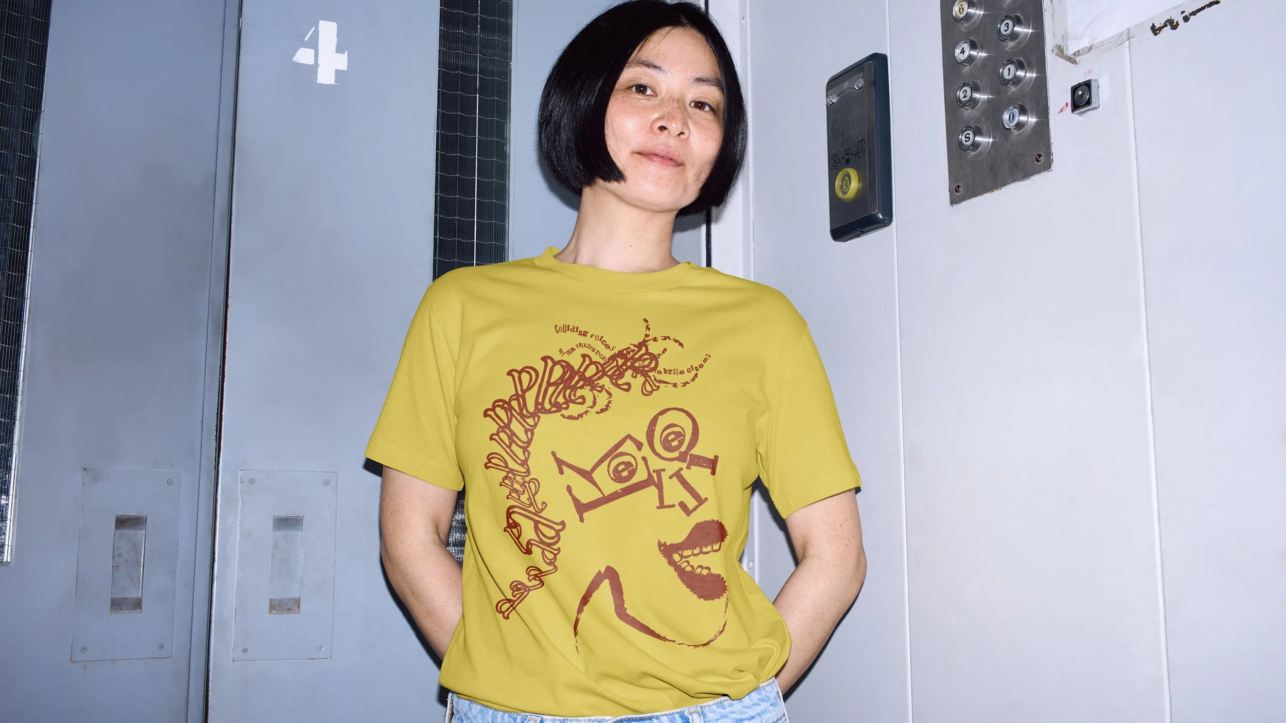
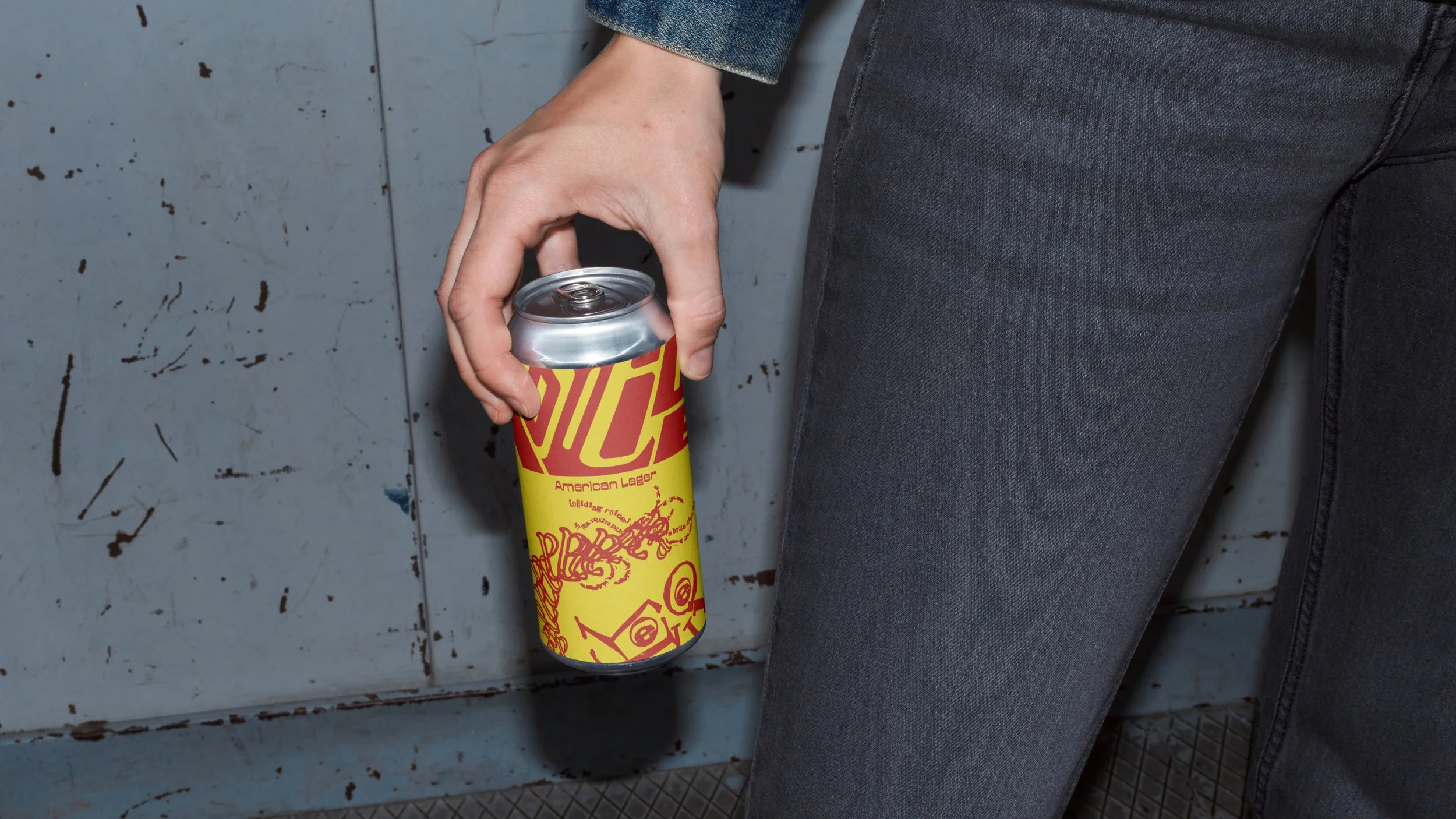
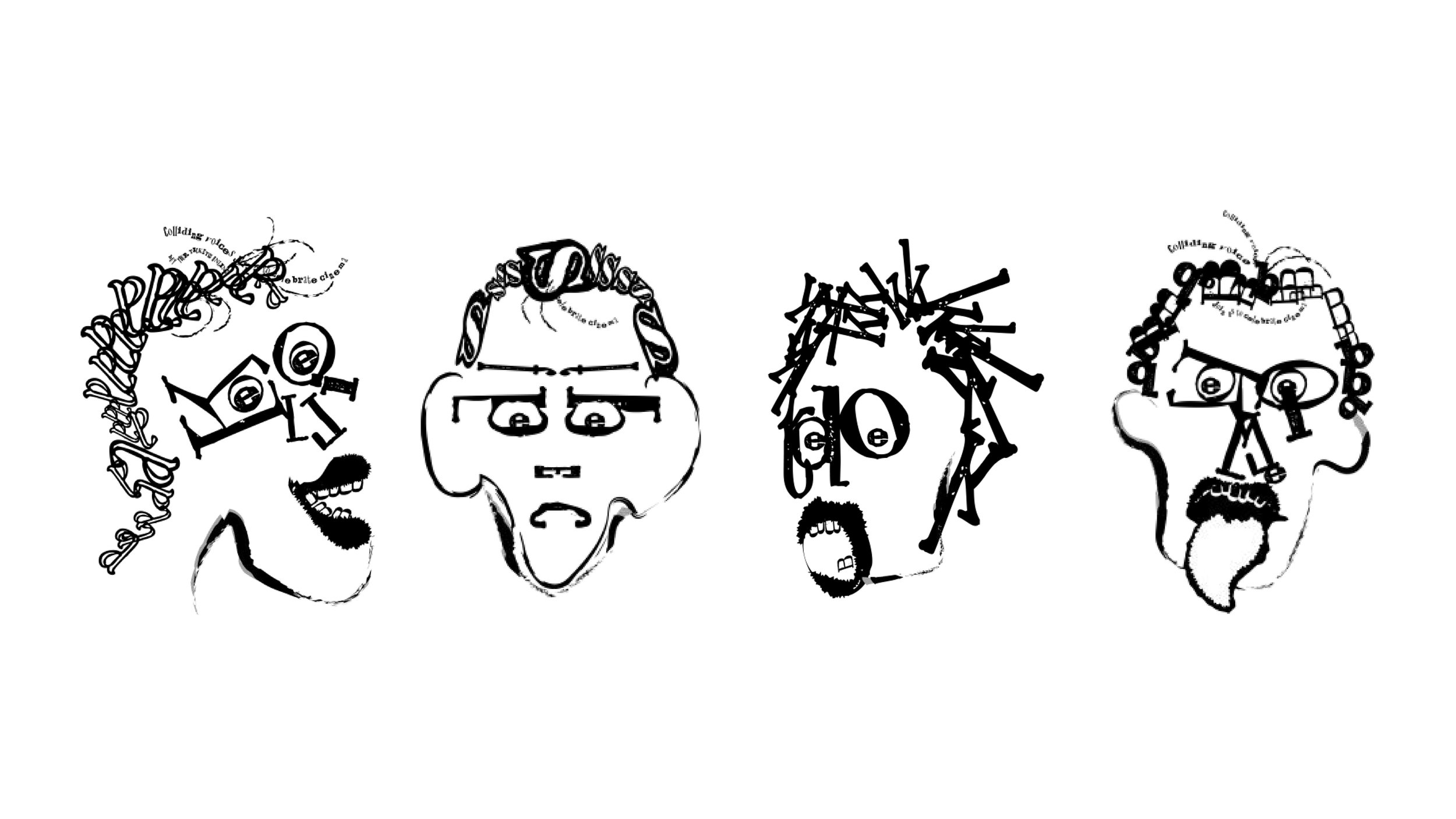
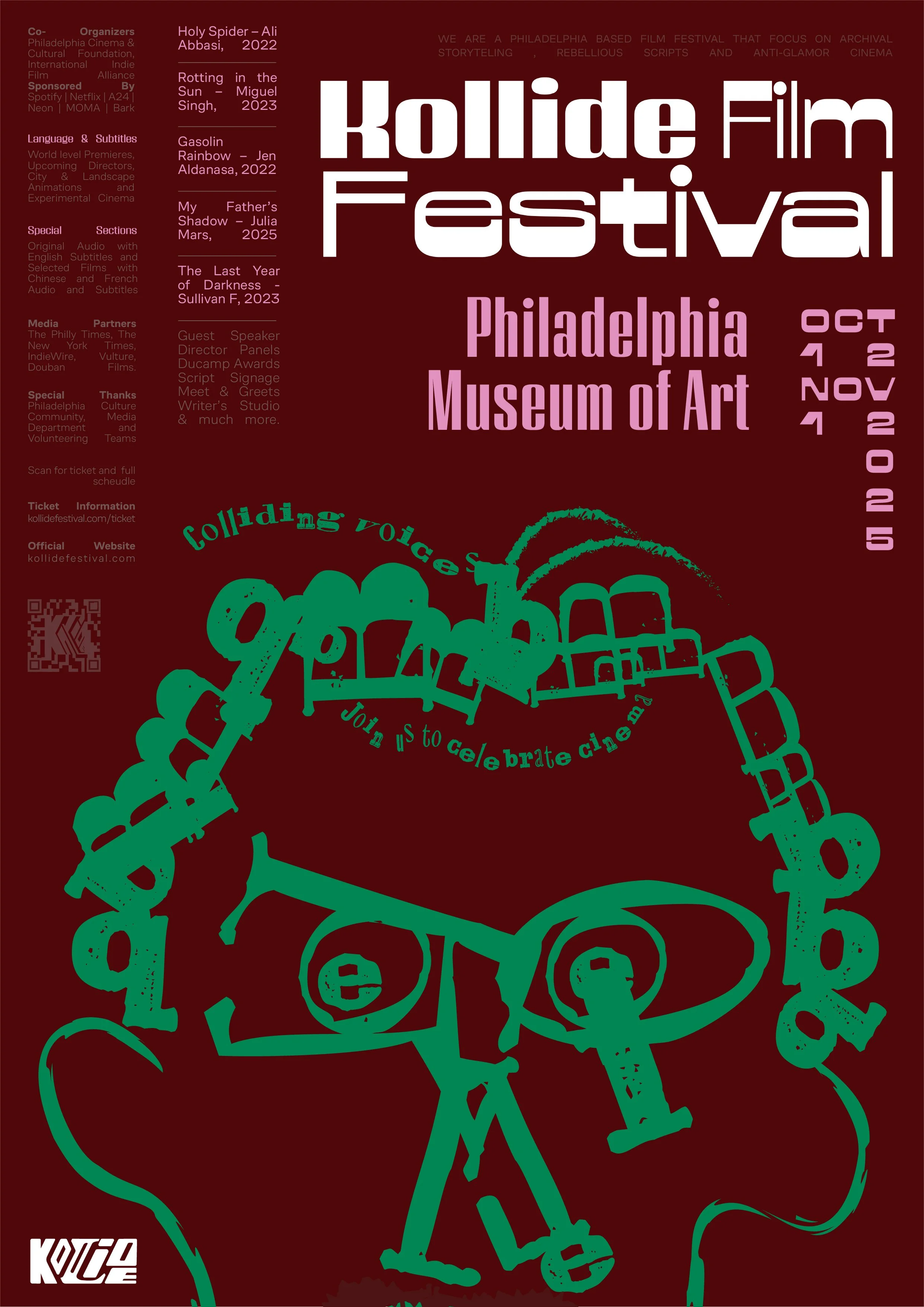
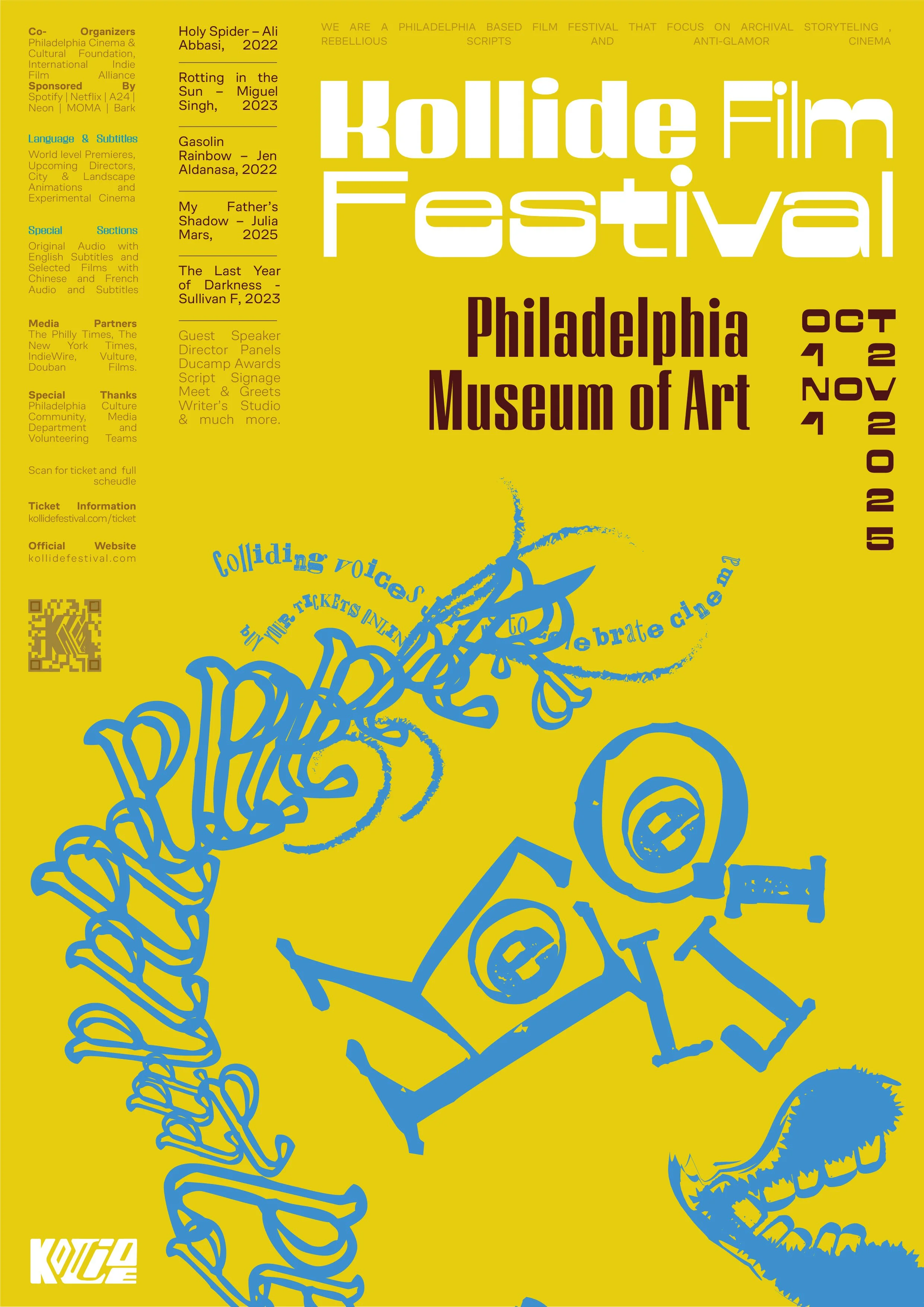
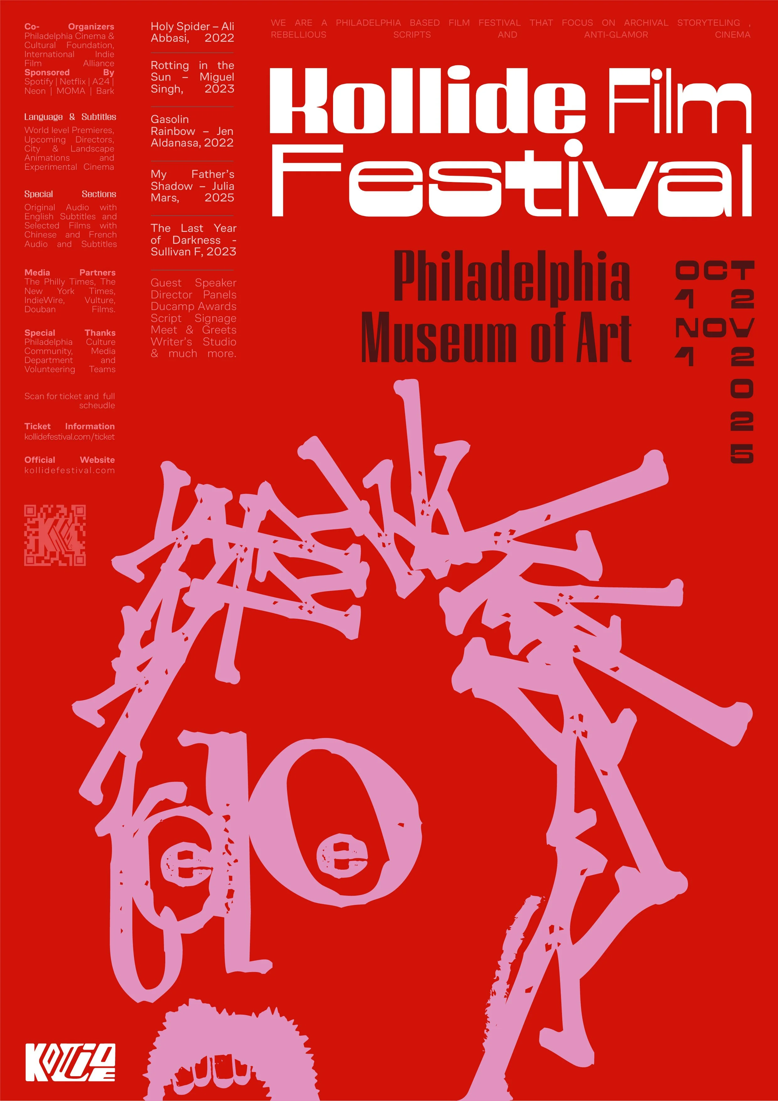
We were inspired by the Dada Movement from the 1920s and wanted to use typography to tell a humanist story. The aim with the illustration style was to be obnoxious, visually striking to create intrigue, and balance it all out with clean, justified copy that is informative.
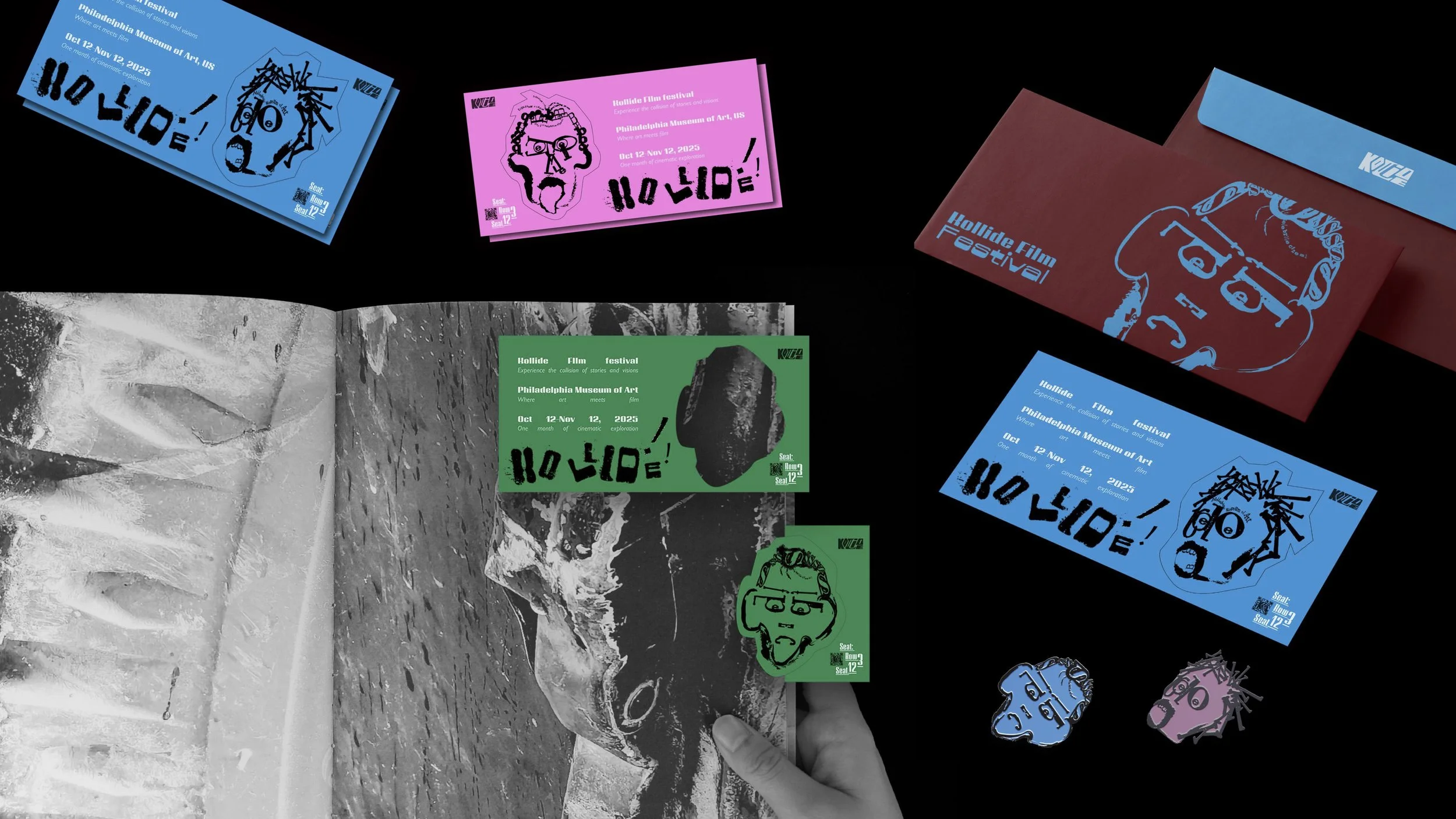
Promotional Material


Posters
xx
Illustration
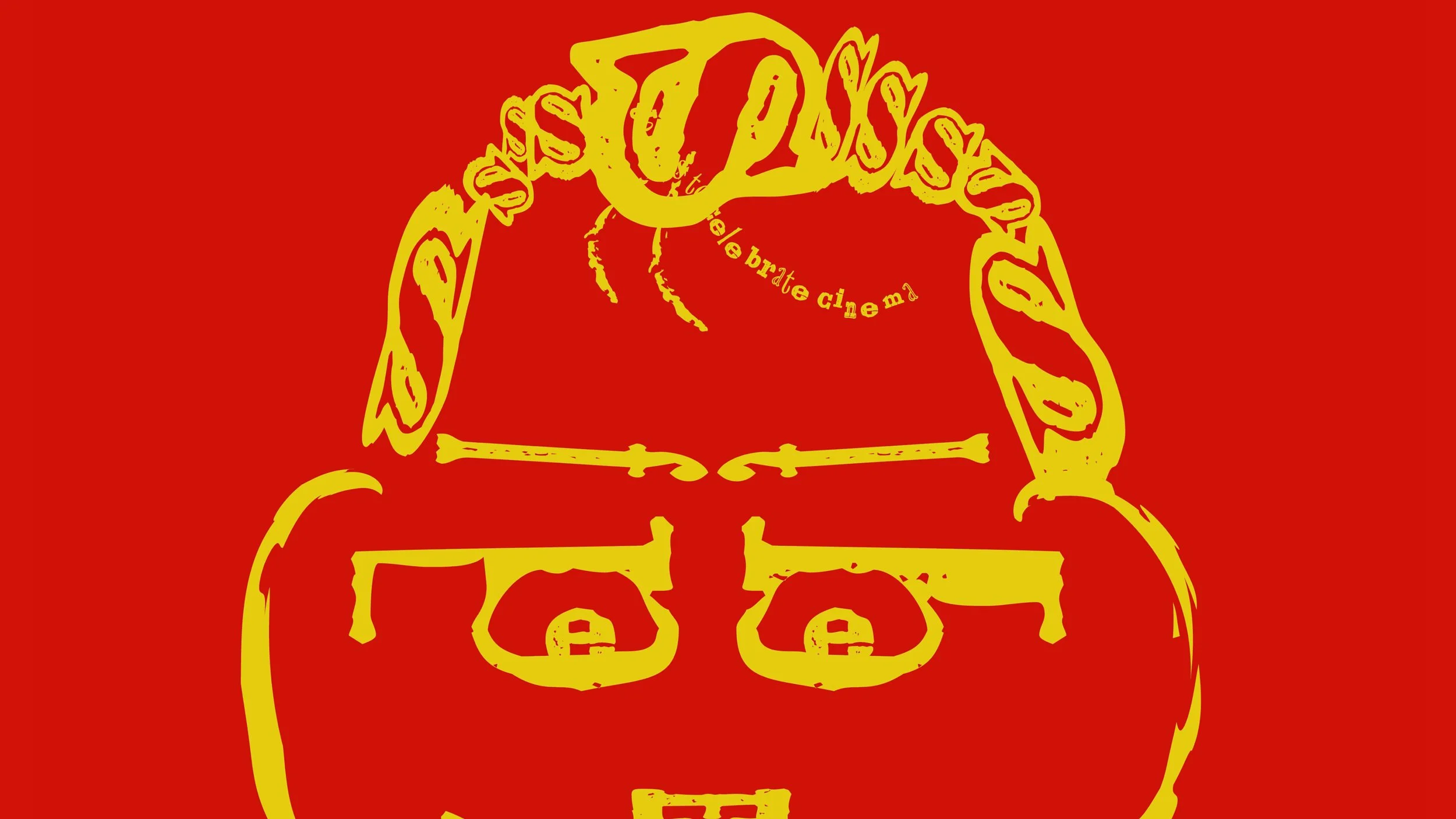
We were inspired by the Dada Movement from the 1920s and wanted to use typography to tell a humanist story. The aim with the illustration style was to be obnoxious, visually striking to create intrigue, and balance it all out with clean, justified copy that is informative.
Social Media
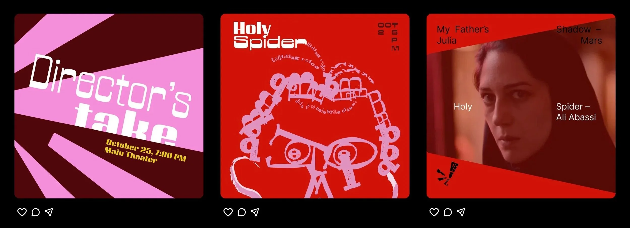
Instagram Grid
We were inspired by the Dada Movement from the 1920s and wanted to use typography to tell a humanist story. The aim with the illustration style was to be obnoxious, visually striking to create intrigue, and balance it all out with clean, justified copy that is informative.